3 Great, Simple Ways to Increase Your Online Presence
I'm tired of the generic terms I see listed as ways to improve your online presence. "SEO, Social Media, Blogs, Link Sharing," etc. These are all very broad terms that go much, much deeper. To learn how to do it right will take years of research and experience.
For those of you who honestly want just a few, simple techniques to improve your online presence, here it is.
Clear call to action. Keep your visitors engaged.
A call to action (CTA) is a set of words, graphics, or buttons that prompt a user to take immediate action or continue on an intended path toward completing your end goal. Every website should have a clear purpose, some goal they want their users to complete. And it should be obvious to both the business, and the consumer.
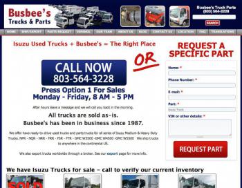
As an example, last month we did some major revamping of one of our sites. We realized that our call to action could be a litte... louder.
This call to action is what the search engine ad links to now when they search for terms related to Isuzu Trucks. It's very clear - if you are shopping for an Isuzu truck, call now, or request a specific part.
Now the customer is less likely to waste time searching the site, get distracted and leave, and more likely to call, talk to someone they like, find a product they want, and make a quick purchase.
So ask yourself “What do I want a user to do once they’ve reached my site?” Do you want them to fill out a contact form, download more information, or sign up for a monthly newsletter?
Start improving the online presence of your business by creating objectives and goals that will keep visitor engaged on your website.
Related: 7 Core Components of an Exceptional Email
Visual Imagery. It’s all about the images.
Visual imagery is the use of vivid and expressive images that fuel emotions and keep visitors engaged. Images are a great way to evoke emotion, and emotion is a great tool to use when trying to convince someone to do something.

Think of when you're driving down the interstate, and you see a billboard for a restaurant. Suddenly you realize you're hungry. But then you go a little further and see a billboard with a steak on it, and you realize you are craving a steak. So you stop there, and get a steak.
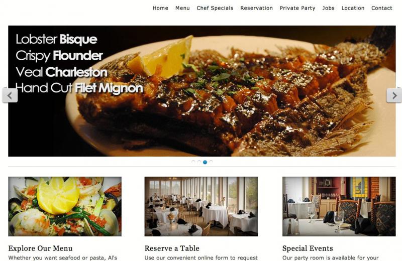
We recently did a site for a local restaurant, and by making the time for our professional photographer to come take pictures of their food, we were able to create a delicious site.
But please note, choosing the wrong images can be devasting to your business's appearance and credibility. Don't make the mistake of choosing bad stock images or bland graphics.
Good images = enhance credibility, make your site look professional, engage consumers.
Bad images = blurry, easy to ignore, don't relate to your content/business, have no real purpose.
Keep Your Site Up-to-Date. Keep the content fresh. Update the look and feel.
Updating a website can mean totally revamping the look and feel of your website or simply updating or removing existing content that is no longer relevant. An out-of-date site is a quick way to loose your credibility and more importantly, potential visitors. If your current site design is inching towards 2-3 years old, it maybe time for a refresh.
For example, we are currently updating our sites to drupal 7 as well as mobile friendly sites. This keeps the site fresh and appealing. If your site looks like it was created in the 90's, it's time to do an update.
Many of our site are commerce sites. If we let the site sit with old products and don't continue updating the online inventory, consumers will quit coming back to the site. Our restaurant sites continually need updated menus, specials and wine lists.
Related: Building Mobile-Friendly Websites using Drupal
Every website should create a great first impression. Spend time researching current trends and revisit the goals of your website, or get in touch with someone who does this kind of thing every day. Don’t forget, trends change on a yearly basis – don’t let your website rock an out of date look for too long.

