
Google's Instant Preview Feature
The benefits of Instant Preview:
- Saves time. You can quickly compare between search results before clicking on any.
- Accuracy. You will know at a glance if this site is what he/she is looking for. Also, this feature will decrease the bait and switch tactic of using keywords to lure traffic only to disappoint upon arrival.
- May reduce Adwords charges. Currently for Adwords, you pay per click. The Instant Preview (free) will prevent clicks as searchers see the site before going there.
- Should increase CTR (click-through rates) and decrease bounce rates.
How can you take advantage of Instant Preview:
- Fix your landing pages. More images, less copy writing. Larger headers. Small print won’t show up on the Instant Previews, but the headlines will.
- Design matters. Does the look of your page convey your message? Potential visitors will decide whether to visit your site without even reading any content, they’ll decide from just one view.
- Reduce your clutter. Sign Up boxes, social media icons, ads, sidebar clutter will not show up well on the preview. Put them near the bottom of the page. Get rid of rotating flash headers.
- Eliminate Forms. Nobody is attracted to a site where they have to fill out a bunch of information.
- Clean-Up a little. Eliminate a few colors and typefaces, be consistent.

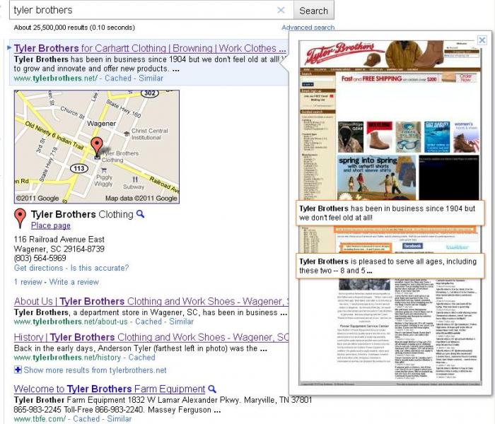
I think Tyler Brothers has an appealing look and is very clear on what you’ll find at their site, however, the slideshow at the top doesn’t show up. There’s just a blank white space. The video shows up as black space, too, but I can live with that. The white space has to go though.
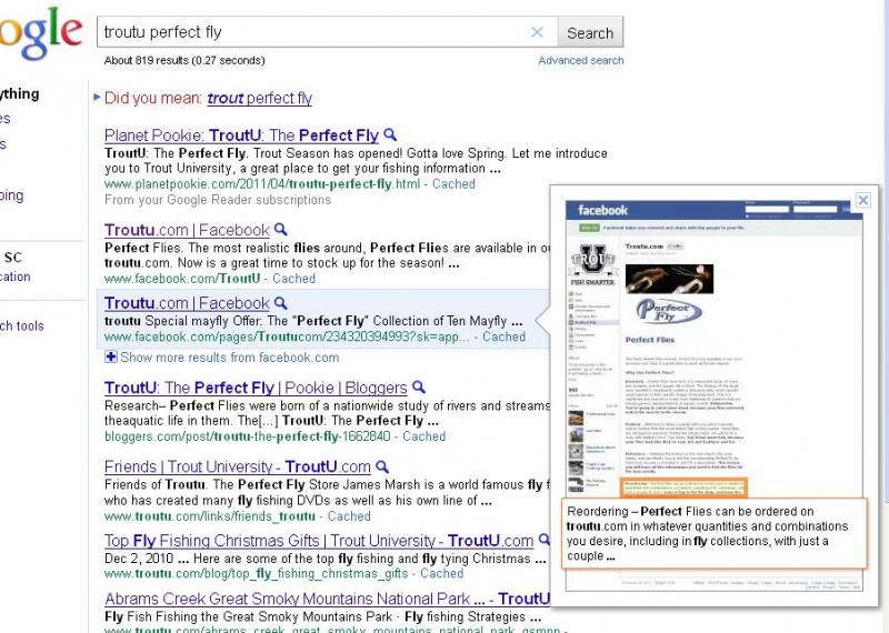
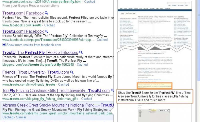
The second is a page that discusses Abram’s Creek, it’s all text and not visually obvious that I can purchase Perfect Flies here. The highlighted snippet, if I read it, tells me where to go to purchase the flies. It’s just not obvious that this is the site I need if I want to purchase a Perfect Fly. But honestly, that’s not the purpose of that page anyway, it just got sucked into the keyword search vortex.
I had one glitch in my Instant Preview experience – I could not get it to work on IE7. Apparently, this is common. If you experience this, you should be able to click on Tools > Compatibility View Settings and uncheck the "Display intranet sites in Compatibility View" checkbox. I still could not get that to work and I think it’s because on my computer, the system administrator controls that.
Go out and play around with it, see what you think. Is this a strong enough tool to affect website design and banner advertising? Maybe. Maybe not.